Beautifully Wrong: How Broken Interfaces Became the Folk Art of the Digital Age
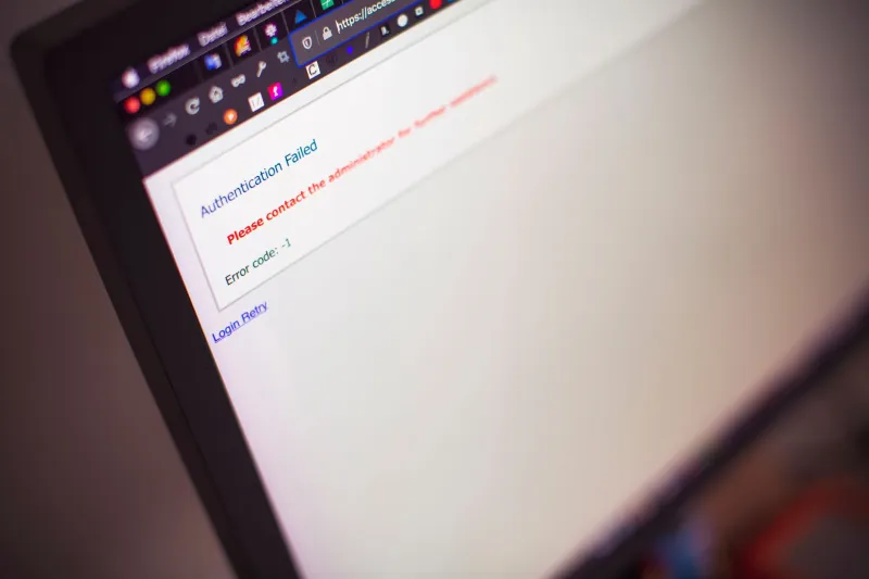
Somewhere on the internet right now, there's a website with a navigation bar that slides halfway off the screen when you hover over it. The font is wrong. The background image tiles in a way that looks unintentional but isn't. The buttons have a faint glow that belongs to 2007 and absolutely nowhere else. And the person who built it? They did all of that on purpose.
Welcome to the aesthetic of beautiful dysfunction — a growing corner of digital culture where broken UIs aren't bugs to be patched but features to be celebrated, preserved, and deliberately engineered.
The Corporate Internet Made People Miss the Mess
Spend enough time on modern web platforms and you start to notice something: everything looks the same. The rounded corners, the sans-serif type, the white space that feels less like breathing room and more like erasure. Big tech has spent the last decade sanding every rough edge off the internet experience, optimizing for frictionlessness until the whole thing feels like a surface you can't grip.
For a lot of younger users — particularly those who came up during the chaotic, maximalist era of early Tumblr, GeoCities remnants, and MySpace profile customization — that smoothness reads as dishonesty. The corporate internet is too confident. It never stumbles. It never shows its seams. And something about that perfection has started to feel deeply untrustworthy.
Broken UIs offer the opposite. A misaligned div, a hover state that does something strange, a loading animation that never quite resolves — these are the tells of a human hand. They're proof that someone was in there, messing around, figuring things out. There's warmth in that. There's also, increasingly, art.
Coding Imperfection In
Designers and developers in indie and experimental spaces have started doing something that would horrify their corporate counterparts: deliberately introducing failure into their interfaces.
Not random chaos — that's just noise. What's emerging is something more considered. Intentional glitches that respond to user behavior in unexpected ways. Menus that take a beat too long to appear, then overshoot and correct themselves. Text that renders slightly wrong before settling. Scrolling that has a tiny, unsettling lag.
The effect is subtle enough that some users can't quite name what's bothering them. But others — the ones already attuned to this aesthetic — recognize it immediately. It feels alive. It feels like the interface has a personality, maybe even a bad day.
This is the philosophy some designers in this space are working from: that a little dysfunction signals presence. That imperfection is a form of authorship. The perfectly optimized interface has no author — it was produced by a process. The slightly broken one was made by a person.
Tumblr Did This First (Kind Of)
If there's a spiritual origin point for the broken UI as aesthetic, it's the golden era of Tumblr theme customization. Users in the early 2010s were handed just enough CSS access to make truly spectacular messes — backgrounds that strobed, sidebars that overlapped main content, music players that auto-played over each other. Most of it was accidental. But some of it was gorgeous.
What those Tumblr disasters taught a generation of users was that personal expression online didn't require polish. A broken theme that somehow captured a vibe — melancholy, chaotic, obsessive — communicated something that a clean, professional layout simply couldn't. The mess was the message.
That instinct never went away. It just went underground for a while, then resurfaced in indie game design, in experimental net art, in the hand-coded personal websites that have been making a quiet comeback in communities that have rejected the monoculture of platform-dependent profiles.
Indie Games as the Lab
Independent game development has become one of the most fertile spaces for this aesthetic. Games that deliberately evoke early software interfaces — complete with fake error messages, UI elements that seem to malfunction as part of the narrative, menus that feel like they're about to crash — have built devoted followings among players who find that discomfort oddly engaging.
Part of what makes it work in games is the way it collapses the boundary between the fiction and the interface. When a game's menus start behaving strangely, you're not sure if it's a bug or a story beat. That uncertainty is productive. It makes you lean in. It makes the experience feel less like consuming a product and more like poking at something alive.
Some designers in this space talk about it in terms of honest interfaces — the idea that a system that occasionally fails or misbehaves is more transparent about its nature than one that performs seamless infallibility. Real systems break. Real code has quirks. An interface that never glitches is lying to you about what it is.
Folk Art for the Network Age
The comparison to folk art isn't just rhetorical. Traditional folk art was defined partly by its relationship to imperfection — handmade objects that bore the marks of their making, where the deviation from the ideal was itself part of the meaning. A quilt with an intentional flaw. Pottery with a thumbprint in the clay. The human trace left visible.
Broken UI aesthetics operate on the same logic in a digital context. The misaligned element is the thumbprint. The glitchy animation is the uneven stitch. In a medium that defaults to mechanical precision, imperfection has become the primary way of saying a person was here.
There's also a community dimension that tracks with folk traditions. This aesthetic circulates through niche forums, through shared CSS snippets, through Discord servers where people post screenshots of their deliberately broken personal sites and workshop each other's glitches. It's passed along the way techniques were passed along in craft traditions — not through institutions, but through networks of enthusiasts who are mostly doing it for love.
What It Means to Choose Dysfunction
There's something philosophically interesting about the choice to build brokenness in. It's not apathy — it takes real skill to make something fail in a way that feels intentional rather than just sloppy. It's also not nostalgia exactly, though the aesthetic borrows from earlier internet eras. It's more like a position.
Choosing dysfunction is a way of opting out of the optimization race. It's a way of saying that the goal of a digital experience isn't necessarily efficiency, smoothness, or the absence of friction. That sometimes friction is where the feeling lives. That a little resistance is what makes an encounter memorable.
In a digital landscape that increasingly treats every user interaction as a conversion funnel, that's a genuinely countercultural stance. The broken UI doesn't want anything from you. It doesn't have a CTA. It just exists, a little wrong, a little alive, doing something the corporate internet forgot how to do.
It's making you feel something.